Spot
An intelligent personal shopping assistant designed for Target shoppers

Studio project
with Himani Auplish, Kate YuWei Guo, Christina Ip, ZhuoNeng Wang
Design Research, Interaction Design, Motion Design, Visual Design
8 weeks
In-store kiosk, Mobile app
Project Objectives
AI-powered Voice User Interfaces (VUI) have shifted the way users interact with computers or machines. Virtual Assistants (VA), a type of VUI, can access and analyze users’ locations and online activities, and they have become an important means for users to interact with other services and applications.
The studio project challenges us to design an intelligent Voice User Interface using both verbal and visual interactions to create novel interactive experiences.
How might we make the shopping experience at Target easier by leveraging the voice assistant?
Target is a one-stop shop for plenty of families providing a wide range of retail services from pharmacy, electronics, to grocery and home decor. It is also a business that constantly strives to integrate the latest technologies into its service. How might we leverage an intelligent voice assistant to enhance Target’s shopping experience for the multi-million shoppers visiting Target every day?
Project outcome
Concept video
Meet Spot!
Spot is a Virtual Assistant designed for Target shoppers to elevate their shopping experience, in-store and at home. With Spot, users can easily complete shopping-related tasks. Spot offers personalized recommendations and answers questions based on personal shopping history.

Spot is available on mobile devices and in-store kiosks. Users’ entire shopping experience is bridged together by Spot.
“Spot” appears on screen in different states. Users could easily identify Spot’s emotions and actions through motion.

key feature 01
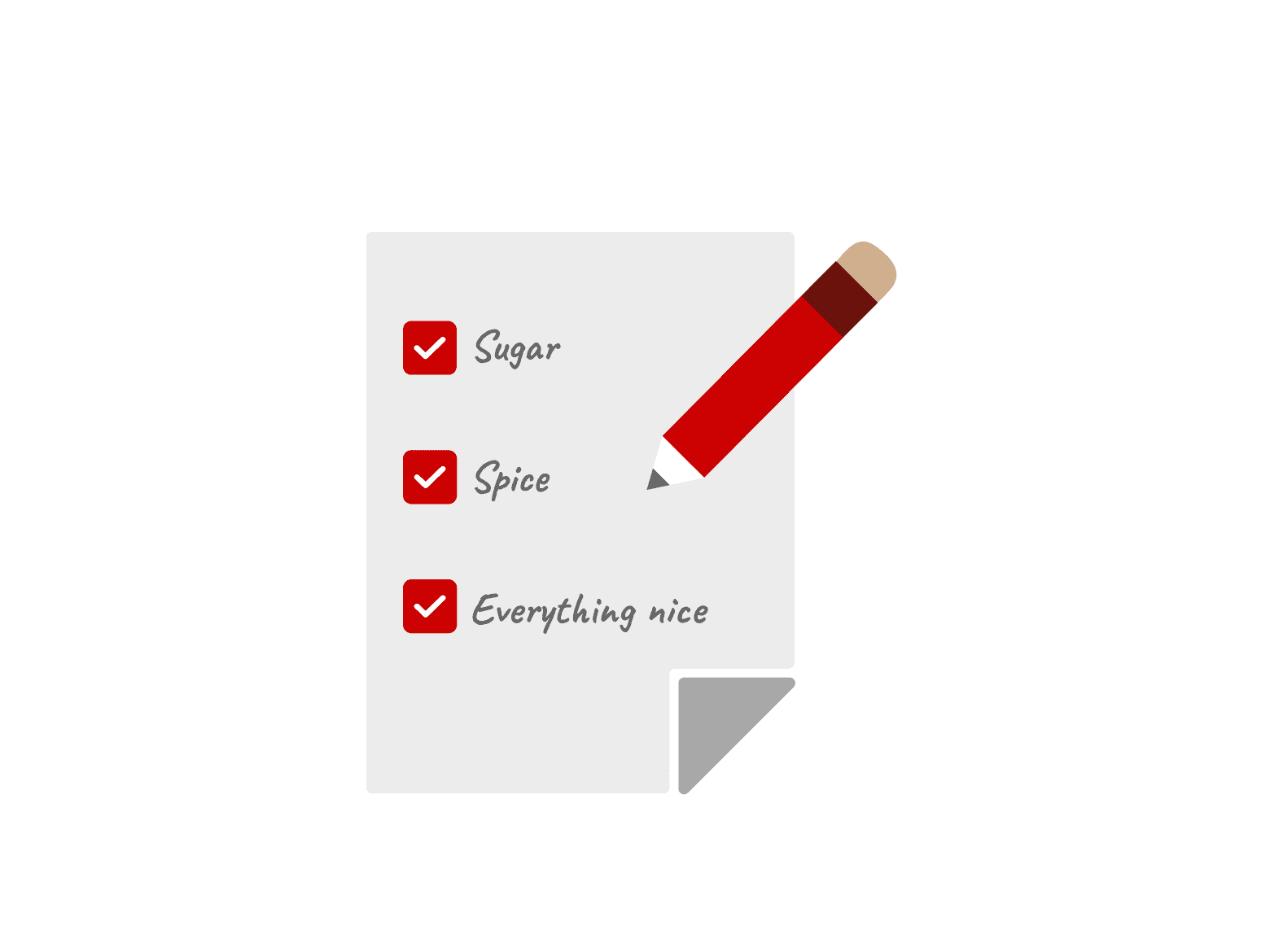
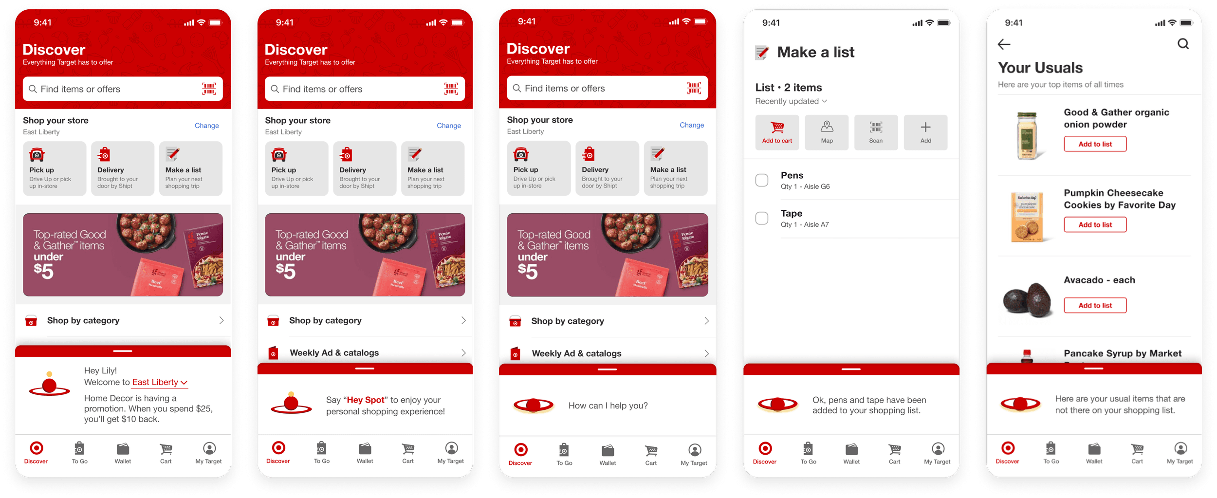
Create a shopping list fast and easy
Spot helps users keep track of the products they need on various shopping lists. Users can easily add and edit their shopping lists with a simple sentence.
key feature 02
Provide reviews and personal suggestions
Spot provides item information including price, rating, reviews and more.
key feature 03
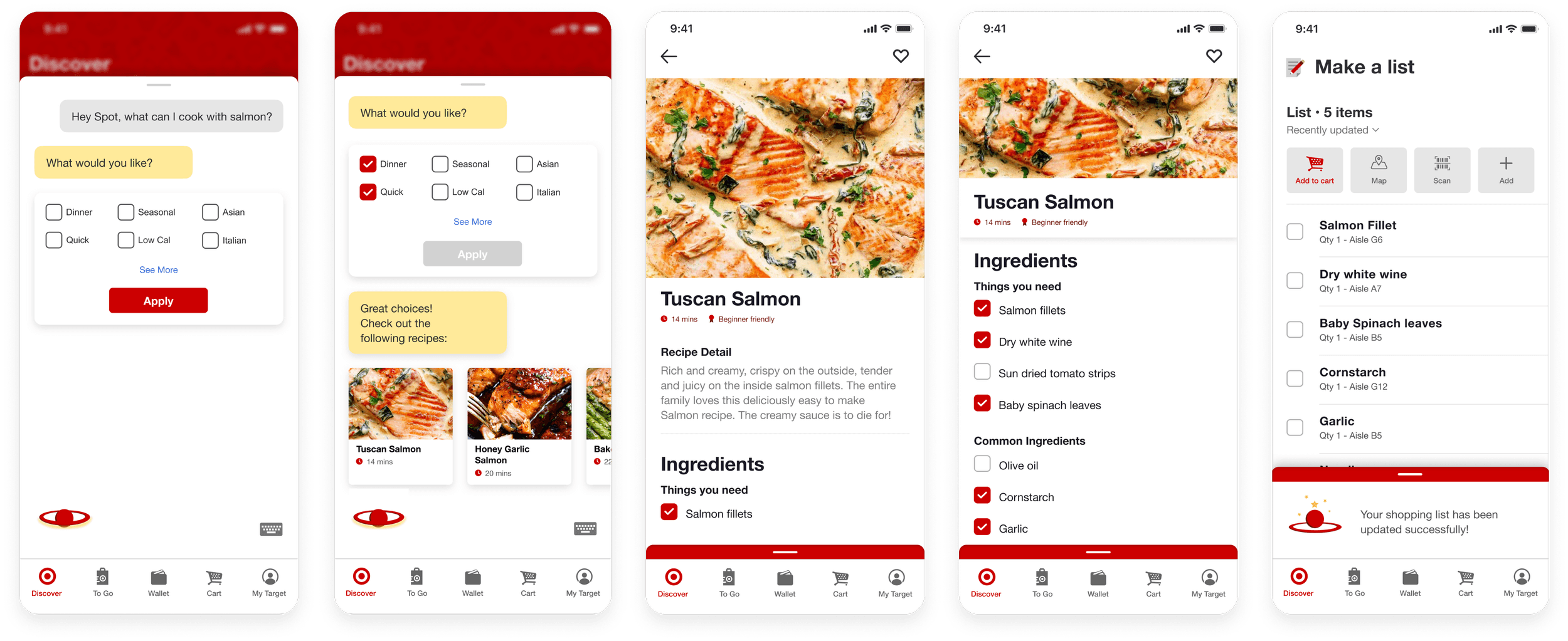
Recommend recipes based on personal preferences
Spot recommends various recipe options based on personal preferences. Spot can also add all the items users need for the recipe to the shopping list. All users need to do is scan the item and choose a recipe.
key feature 04
Generate the fastest route to complete the shopping list
Spot can recommend the best route for users to finish their shopping list when users are in a hurry.
All Features

Design Process
User Interviews
We conducted user research to gain more insights on regular Target shoppers. We interviewed 4 shoppers including one college student, single and married couples whose ages range from 20 to 40 years old. We asked specific questions regarding their shopping habits & preferences. We gathered three main insights from the interviews:
Insight 01
Regular shoppers sharing common shopping patterns
Target shoppers are people of habit. People visited the clothing section first, downloaded coupons the day before they go, or picked up coupons immediately upon entering. These were just a few of several habits shared across all participants.
Insight 02
Countless options and various distractions
Without a list, it was very easy to forget what you came for. With a variety of goods ranging from groceries, electronics, and more, it was easy to get distracted. In addition, clearance and new merchandise were constantly rotating.

Insight 03
Target runs followed a flexible schedule
Target runs ran on a schedule. For example, a mother of two would go weekly to purchase staples but when birthdays came along, they had to buy gifts. In these situations, the Target list were flexible and changed according to the circumstances.
Journey Map
We mapped out the typical shopping experience with scenarios, users’ emotions, and necessary touchpoints. We identified a handful of pain points including forgetting items, being unable to find items, losing directions, limited time to complete shopping.....etc. At these particular scenatios, we started to brainstorm ways users and Spot would interact.

Defining Persona
Based on the research, observations, and interviews we previously did, we identified parents and caregivers as our target audience because they had to go the most often for their household.

Biography
Lily is a frequent customer at Target. She does a grocery run every week and a complete target run at least twice a month. As she is a mother of two, she often has things to pick up apart from groceries all the time and that makes Target her go to one-stop shopping experience.
Needs
As a working mother, she doesn’t have much time to spare. However, if she does, she loves to explore all sections and sales at Target.
Pain Points
There are often questions about products that she wants to ask but she usually lets it go because there are no available avenues to seek answers and it can be inconvenient to locate a staff member to help her out.
For these scenarios, Spot is here to help. With his functionalities, Spot becomes Lily’s personal shopping assistant for all her questions and can even provide recommendations based on her shopping patterns and history.
VUI Design Development
These are the four keywords we defined for our virtual assistant based on our secondary research on Target’s branding identity. We sketched out ideas that we think can represent those keywords.
Bright
Attentive
Friendly
Effective


Through various conversations and discussions, we decided to choose the Ball + Ring as our main visual for the VUI. We think that this form ties with the current Target logo the best. And by adding the additional dimension to the form, it could stand out more within the Target application. Moreover, the motions that we could explore and create with the bouncing ball and 2.5D ring was more dynamic which ties back to the “bright“ characteristic we set up for our VUI.

After deciding on the basic elements and form for our VUI, we started to sketch out different motions for it. we mainly focused on the interaction between the ball and the ring. We also added a new yellow element that could morph into different shapes to express different emotions of the VUI.

GUI Design Development
Target had an existing app that was filled with multiple features. We extracted design guidelines from the current Target app and designed new feature interfaces that aligned with the design guidelines.

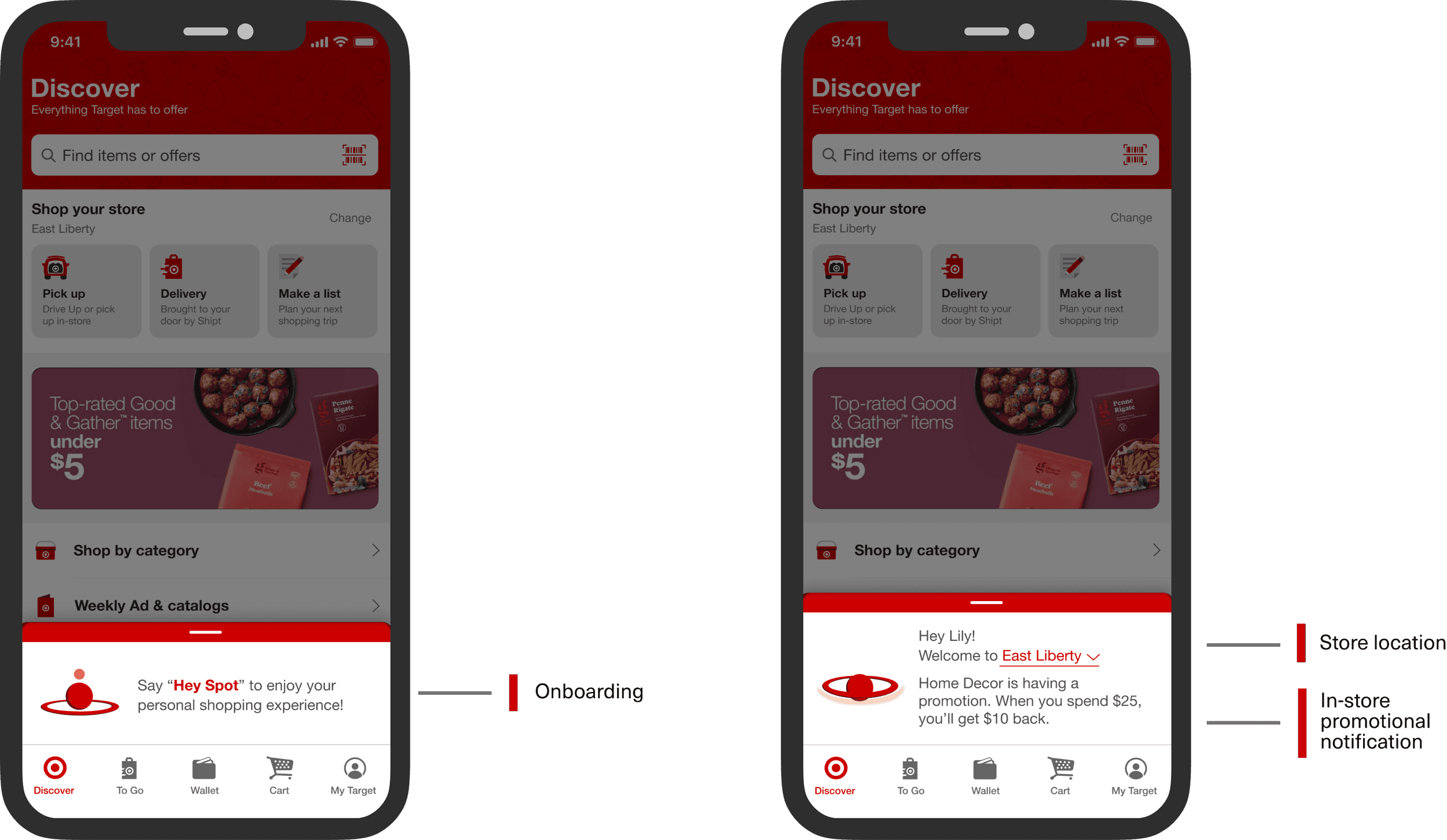
The placement of "Spot"
We brainstormed and explored different possibilities for placing the VUI on screen. The left three screens are some explorations we went through. However, after some testing & internal design reviews, we decided that these approaches included too many components and layers which would very likely cause confusion for the users. As a result, the final version that we have is the one on the right-hand side. It’s a flexible extension of the main menu that includes the VUI, dialogues, and any other crucial information.

Color usage
In the first few iterations. we were using a lot of reds since it’s the primary color in the design system. However, red is often associated with errors and mistakes. It might be alarming for the users to encounter screens with a lot of red components. Therefore, we decided to include more secondary color (yellow) components in our design. Also, we were extra cautious with the usage of the portion and placement of red components.

final design 01
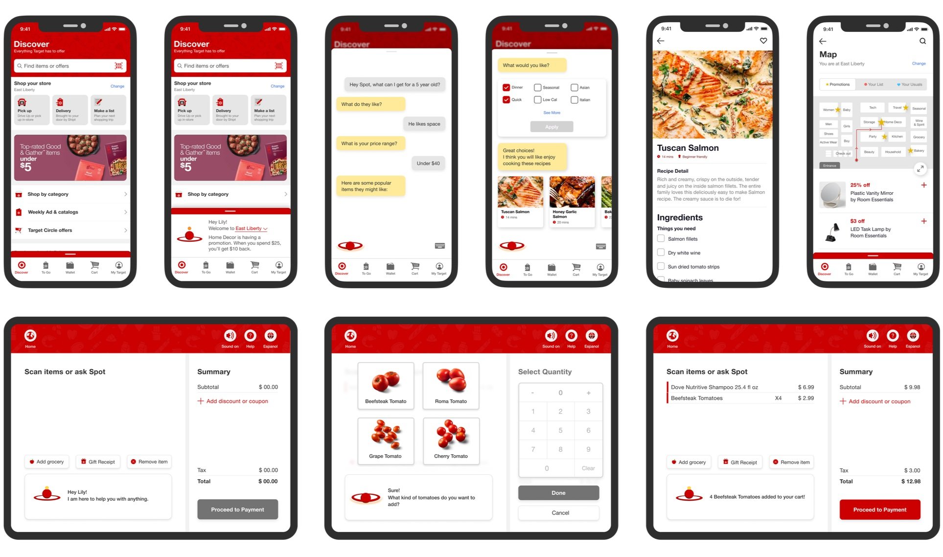
Interface Interaction
We spent much time testing out the best way to insert “Spot“ onto the interface without clashing with the existing design & features. We landed on three display modes of the conversation box which would appear according to users' needs and commands.

final design 02
Short Commands
Users say “Hey Spot“ to activate Spot anytime when they need anything. The conversation box contains Spot’s response and other essential information. For example, When users enter a specific store, Spot will appear with the detected store location. Users can manually switch between stores if neccesary.

final design 03
Recipe Recommendation
This feature was designed for users when they see a particular item but don’t know what to cook with it. In this case, the user sees a salmon in the fridge and asks Spot for recipe recommendations. On the screen, we designed smart filters for users to select according to personal preferences and also a recommendation carousel to display the recipes according to users’ preferences.

final design 04
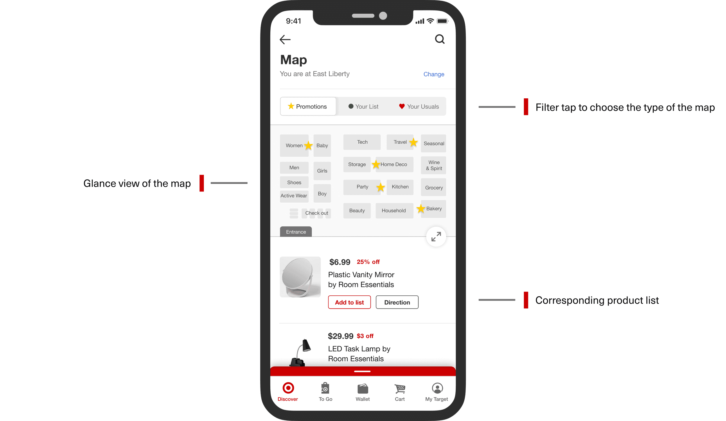
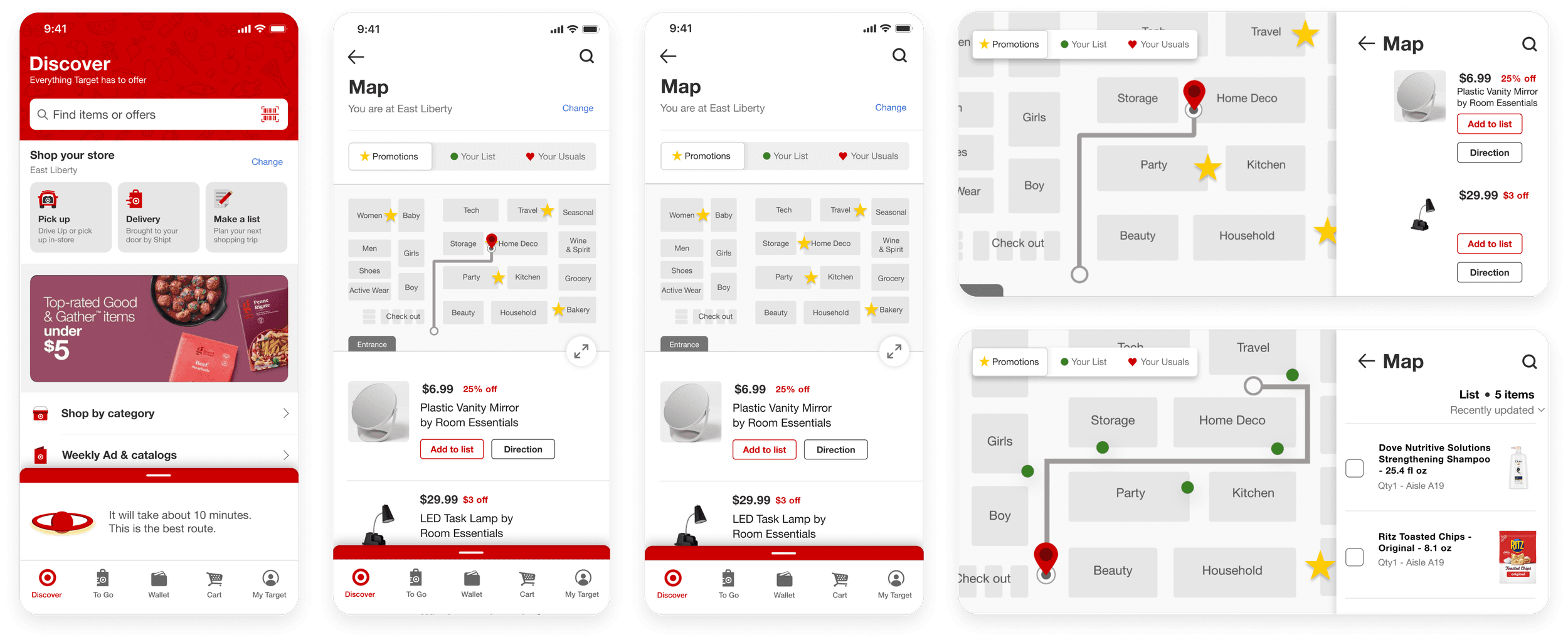
Map
The original map feature on the Target app was relatively inefficient. We redesigned the feature with filter tabs to switch between different types of usage and corresponding product list for users to easily scroll through multiple items. The map feature also offers a landscape view where users can have a better glance at the map and follow the suggested route more easily.
Learnings & Takeaways
Designing a voice user interface
When designing a VUI, a lot of thought goes into deciding the appropriate inputs and outputs for every scenario. It is essential to determine when it is appropriate for Spot to provide a short audio answer and when visual aids are necessary. Through this project, I gained knowledge on designing a multi-modal experience and understanding the crucial factors to consider during the design process.
Understanding AI capabilities and limitations
One of the major challenges that we encountered during this project was the limitations of AI assistants. While it would be ideal to have a super powerful assistant that can understand the user's needs, the capabilities of AI assistants are still evolving. In 2021, privacy concerns were also at the forefront of our minds, and we made sure that our approach and solutions were well-balanced and respectful of the user's privacy.
Cross-device experience & bridging the gap
Spot exists within a cross-device ecosystem, from the mobile app to in-store kiosks. I learned how to design a cohesive experience that works seamlessly across devices and also between digital and physical spaces. This involved understanding the different user needs in varying contexts and paying close attention to how users transition from one scenario to another.